Ahmed Omer

SpotSwift: finding a parking space, simply

As malls and popular destinations grow, the everyday question becomes: where can I park, and how much will it cost? Map apps answer where, but not whether a spot is free or any good. This case study looks for a better way.

Duration
5 weeks
Platform
Android & iOS
My role
UI/UX designer
5 wksConcept to final iOS & Android UI
6Urban parking pain points resolved
End-to-EndResearch, IA, flows, wireframes and UI
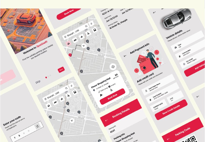
SpotSwift app screens
Final screens: map search, spot details, booking and adding a payment card.

The challenge

Dense cities face six tangled parking problems. The app had to ease as many of them as possible.

  • Space scarcity

    Land in big cities goes to shops and homes before parking, and demand far exceeds supply.

  • Traffic congestion

    Drivers circle blocks looking for a spot, and some double-park, blocking traffic and creating hazards.

  • Cost and pricing

    High fees for short stays, plus hidden charges for services like valet parking and security.

  • Safety and security

    Risk of theft in poorly lit areas, and walking back from distant spots at night.

  • Payment hassles

    Many car parks still rely on cash, and drivers don't know the exact fee until they arrive.

  • Regulations and zoning

    Rules change by city, neighbourhood and time of day, and some zones are for residents or permit holders only.

The solution

Historical data predicts peak hours and availability, so people can plan their trip ahead. The interface keeps cognitive load low, so the right option is found quickly and without confusion.

It also combines parking information with public transport data, so people can choose the best mix of driving and transit. And efficient parking means less unnecessary driving, and lower emissions.

Tools: Figma, Adobe Illustrator and Adobe Photoshop.
Design strategy

Business goal
Simplify parking, improve urban mobility, and make searching for a spot a better experience.
Target users
Vehicle owners aged 18 to 55.
Core tasks
Pick a location, see available spots, choose one and review it, book it, then pay.
Success means
Booking a spot at rush hour, paying online, and extending the booking time.

Flow and structure

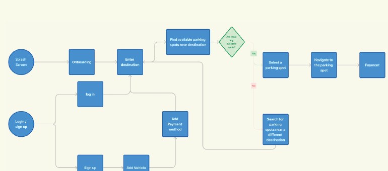
Before any screen: how people move from opening the app to paying, and where every piece of information lives.

User flow diagram
User flow: from splash screen and sign-in to finding a spot near the destination, then navigation and payment, with a fallback when no spots are free.
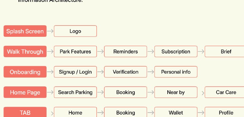
Information architecture
Information architecture: walkthrough, sign-up and verification, home, the four tabs, and spot details.

From paper to screen

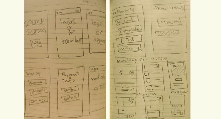
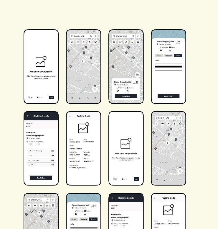
Quick paper sketches to test the idea, then wireframes for every screen before any colour or detail.

Paper sketches
First sketches on paper.
Low-fidelity wireframes
Low-fidelity wireframes.

Visual language

One clear red for the actions that matter, like “Book now”, with lighter tints for backgrounds and states, and dark and grey text for a clear hierarchy. The typeface is Inter Display in Light, Medium, Semi-bold and Bold.

Red, base
#E11C42
Red, light
#F8CAD4
Red, lighter
#FDEFF2
Main text
#0F0F13
Secondary text
#878E9A
Text on red
#FFFFFF